|
Typography is a style and appearance that is printed. Typography is important because it creates a consistent design that is good to see. The quote, "Each font has a personality and a purpose" means that each font you chose would match or wouldn't look good depending on how you use it. Five different fonts we learned was: Serif: has "legs" on the ends of the letters; can be used in newspaper titles San Serif: is smooth and is mostly seen in google docs, etc and commonly used Monospaced: has equal amount of spaces in each letter; found Script: is fancy/cursive; is like calligraphy and an example where it can be used can be a letter/invitation Display: funky fonts; advertisements, games Typeface ComparisonIn the Typeface Comparison assignment, I used the same word but in different types of fonts (serif, san serif, monospaced, script, and display). I wrote each type of font and the name of the font on the side. The image below shows my work: 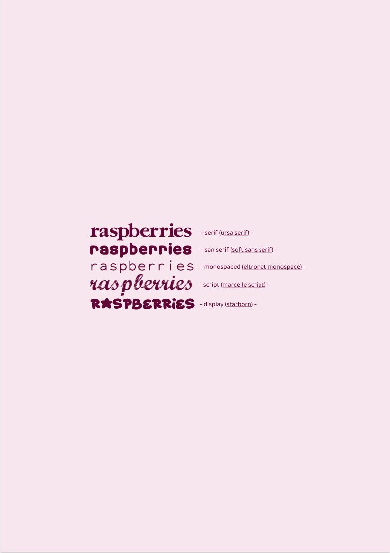 Word PortraitsAnother assignment I completed was called the word portrait. This time I used 10 different fonts with different words each time. I used a word that will match the font and next to it would be a word that I think doesn't match with the font I used. Afterwards, I wrote the name of each font on the right corner of each row. 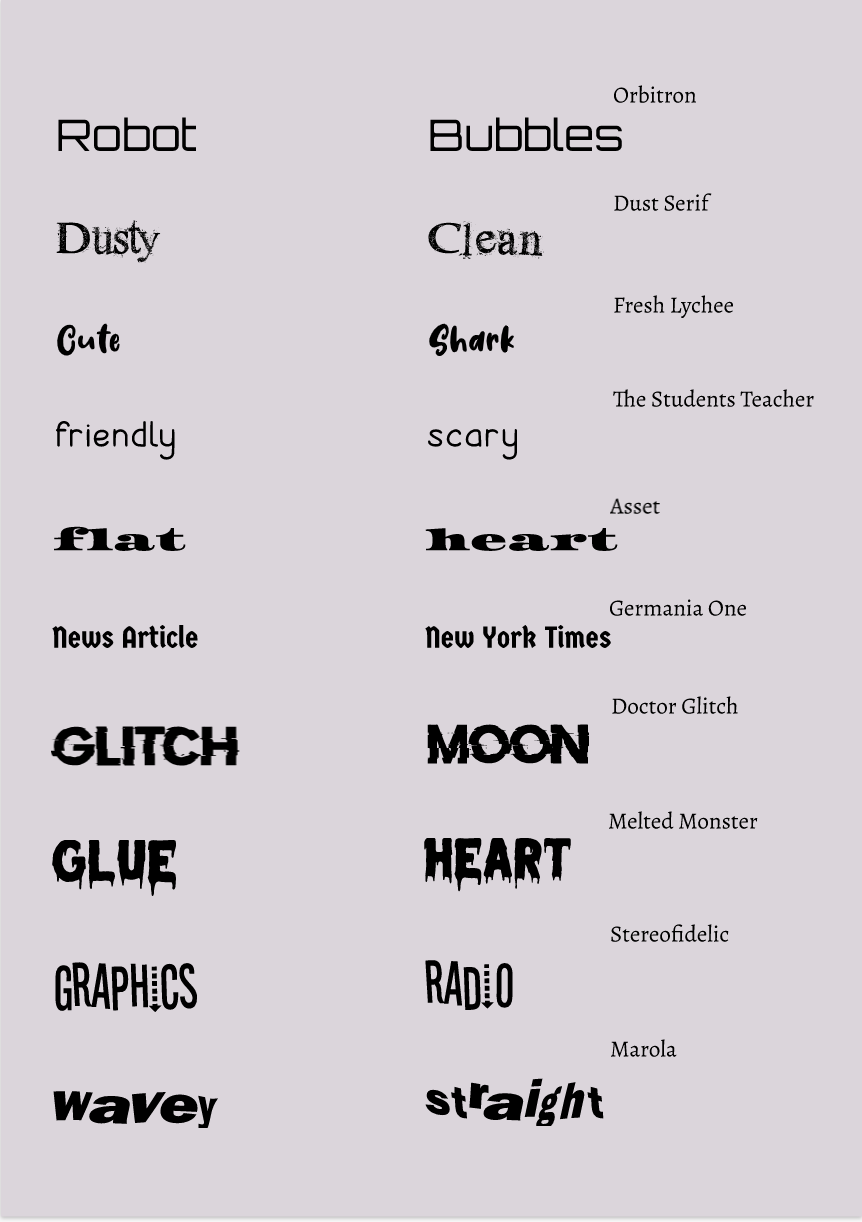
0 Comments
Leave a Reply. |
Archives
April 2021
Categories
All
 This work is licensed under a Creative Commons Attribution-NonCommercial-NoDerivatives 4.0 International License. |
