|
My three logo variations is a nickname that I made up for myself. I replaced the colors for the third one and I made a different design for the "o" in nomnom. The tools I used were the pen too and the circle drawing option. I also used drop shadow for the "o" in the logo. The most frustrating thing was when I had to do the legs of the ladybug or the chocolate of the cookie. I overcame it by copy and pasting. I enjoyed writing the words and drawing the frog because it was fun to do. As I saw the project become finished, I was relieved and satisfied of what I did. 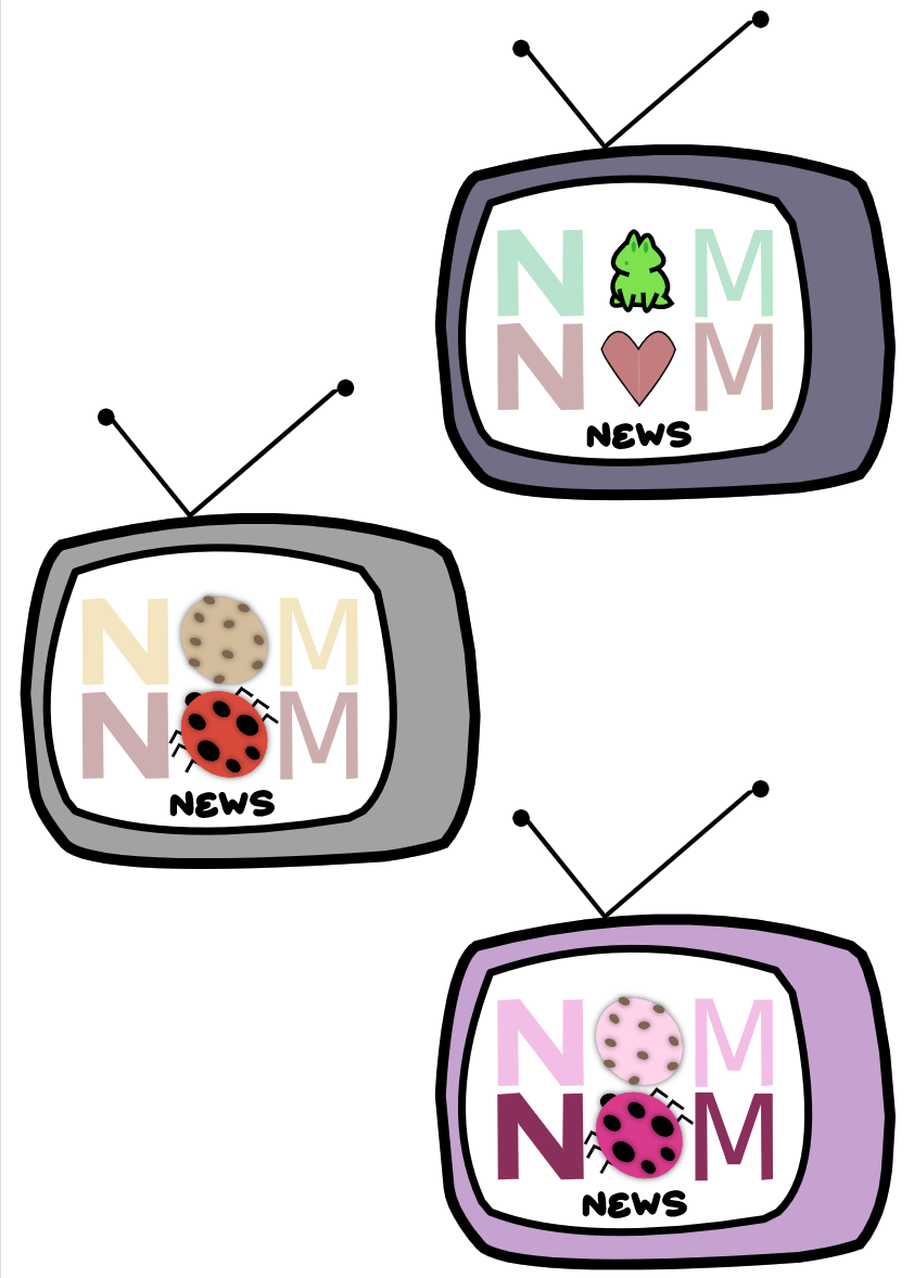 The name of my brand is nomnom news. I just wrote the name of my brand and replaced the "o" in the word and drew something else. The brand is just a news reporting show. This represents myself because some people know what nomnom news is. My favorite one is the grey one because I like chocolate chip cookies and ladybugs. I liked how I tried to do a pink theme and then a total different theme by changing the icons instead of the color. It was fun drawing the frog and the cookies because they look cute. 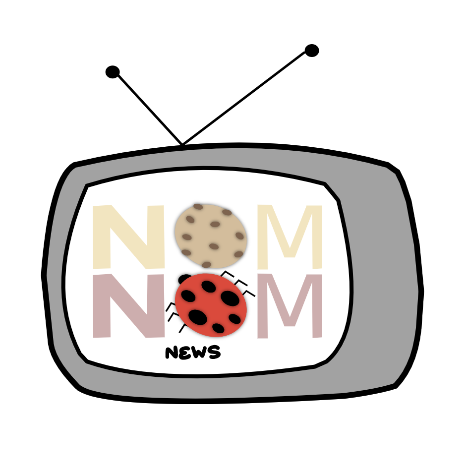
0 Comments
Leave a Reply. |
Archives
April 2021
Categories
All
 This work is licensed under a Creative Commons Attribution-NonCommercial-NoDerivatives 4.0 International License. |
